Blog
Jargon Buster: Graphic Design

The situation will be familiar to many. Odd sound coming from engine. You rock up at the local garage. Slow intake of breath from mechanic… ‘It’s the – – – – mate.’ Apart from that sinking feeling this is gonna cost you, you’ve absolutely no idea what he’s talking about!
It’s tricky when you don’t understand the terminology of a thing, let alone have specific knowledge about it. And in the world of printed paper promotional products, there’s a lot of talk about ‘artwork’: bleed, high-res, CMYK, and so on.
That said, we have come up with a handy list of some of the most common terms to help with your next visit to the design agency or the printer’s.
Airbrush. A fine spray of ink or paint to retouch an image.
Alignment. Getting text and pics where you want them and ensuring it’s all in the right place.
Bleed. Added space, say, around a poster, that’ll be cut off after printing so your chosen colour/design goes right to the edge of the page.
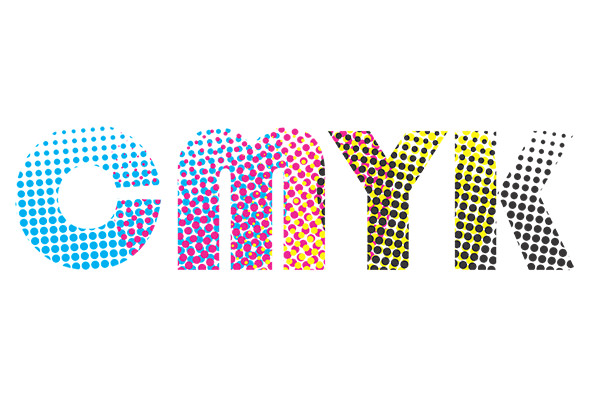
CMYK. Also known as process colour or four colour, CMYK represents the four colours – cyan (blue), magenta (red), yellow and black. Using this method the four are layered on each other to create the colour you want. Many printed items are two-colour, which is cheaper than four.
Complementary Colours. Ones that go well together but are found opposite each other on a colour wheel – a printed circular device used by printers and designers.
Copy. What you’re reading now! Any text that’s printed with your images.
Crop. Removing unwanted parts of an image, usually in digital photography using a computer crop tool.
Die Cut. Shapes incorporated to make a design stand out.
Dot Gain. Ink absorption or spread that occurs during printing.
DPI. The quality of an image depends on the number of printed ‘dots per inch’.
Emboss. For example, where a book cover is punched out to create a raised area to highlight part of an image or text.
High Resolution. Also termed ‘high res’, you’ll need these types of image to get high quality printing.
Imposition. The way printers lay out pages so that when printed and bound they’ll be in the correct order.
Justify. Making a line of text fit by varying the spacing between words.
Kerning. Widening or narrowing the space between letters, especially when dealing with large type, say, on a banner.
Negative Space. Areas where there are no words or images, aka white space.
Pantone Matching System. PMS allows designers to match colours accurately and tells printers how to make them. PMS swatch cards show clients how a colour they’re seeing on a computer screen will look when printed.
Raster Images. Pics you find on the internet and the ones on your phone are raster images. They’re made up of a grid of pixels or bitmaps. When enlarged raster images lose sharpness.
Rivers. White gaps in columns of type.
Trim Size. The size of your finished printed material once cropped.
Vector Images. Images that can be expanded or reduced without loss of quality.
Zone Information Protocol. Zips are compressed computer files that can be emailed easily.
At Arcadia, we pride ourselves on giving consultative advise on all branding matters, our experienced account team and in-house studio are here to help with any print-related questions you may have. Contact us today at info@arcadiaonline.co.uk.
Make Memorable Merchandise
[mailmunch-form id=”172197″]
Having worked in Promotional Merchandise for the last 25 years I have been exposed to all aspects of the industry. Starting out as an account manager working with some of the worlds leading brands, I have learnt to understand the needs of a client, manufacturing processes, and what it takes to deliver a successful promotional campaign that is on brand, on time and within a given budget.
